http://jolliepopsarah.wix.com/bad-gals-fc-3
Monday, 18 March 2013
Friday, 8 March 2013
Finished digipak
Here is the finished Digipak. We took in our final audience feedback from the focus groups we held and made the appropriate changes to the digipak in order to create a final, matching package.
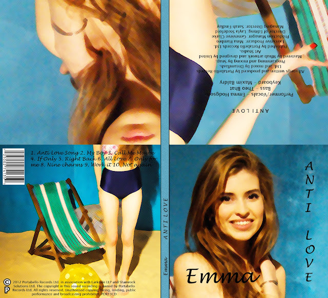 I added a water colour filter and brightened each photograph in order to make all the photographs link together, and also adding unique qualities to the digipak (aka the watercolour filter). I also changed the font so it is clearer to read and made the writing black instead of white, also making everything easy to read.


Saturday, 19 January 2013
final ideas about the digipak
We all decided to have a group meeting after everything we had learn't through the evaluation stage. We all decided that the digipak could be improved and it needed something extra. I went onto photoshop and looked at changing around the text and panels to see if a different photograph would be better for the cover. I found a photo I took of Emma smiling at the camera and I thought it looked much better as the cover. I then looked at different filters we could put over all the panels in order to make them tie in together and give the digipak a more professional effect. We decided on using a cross-hatch filter over the panels and brightening the images a bit. This gave the digipak a more surreal effect and this fits in with our star image of Emma living the 'fantasy dream' life. Cheryl Cole's CD "Messy little Raindrops" has the same kind of "dreamy" effect to it, so this inspired a bit of our idea to use a filter --


Subscribe to:
Comments (Atom)